![]()
![]()
![]()
![]()
![]()
![]()
![]()
Multi-lingual typography is like human partnership: highly complex, requiring different types and degrees of compromise, depending on the individuals as well as the desired result. Sometimes you need two writing systems to have equal presence on the page; other times you require one script to be subservient to the other. ¶In contrast to this, contemporary multi-script fonts are generally one-dimensional: they feature a proper Latin style, but the non-Latin components are made to conform in structure and detail to the Latin, rendering them inauthentic and dysfunctional.
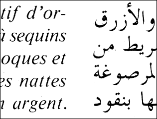
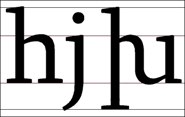
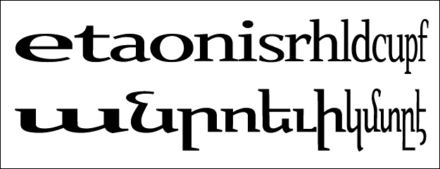
Scripts that have superficial similarities to Latin are especially prone to having their features –in particular their vertical proportions– distorted, in order to enforce formal harmony. But this harmony is only skin deep. Especially in a text face such geometric congruence cannot produce acceptable non-Latin setting, for the simple reason that written language is not merely a set of letters. ¶By using linguistic data to visualize each writing system one can better observe the true differences between them, such as their varying reliance on extenders. Part 2 (of 3)